Make Your photo better one piece at a time.
By Debbie Grossman Posted September 10, 2009
Want to really harness the power of Adobe Photoshop to improve your photos? You’ll need to make a good selection first. Whether you want to extract a subject and place it on a new background, or just modify a portion of your picture, you have to start by selecting the area correctly. Here are step-by-step instructions for great selections, and a way to save them for later use. With the image here, we’ll simply blur the background to make the woman and her balloons stand out. But you can use your selection to make other changes, from tweaking the Levels on an Adjustment Layer to distorting the subject’s size.
1. Duplicate the Background Layer, and work on the copy.
Type W for the Quick Selection tool. Pick the Add to Selection brush (circled), then paint along the woman and the balloons to make a selection— Photoshop will do most of the work.
2. Although your initial selection will be a bit rough, you can keep using the Quick Selection tool to perfect it.
(This step is not pictured.) How? Zoom into your photo for a close-up view of one of the more complicated edges of the selected area, then shrink your brush size. Switch to the Subtract brush (it’s to the right of the Add brush), and paint on your image to remove the selection from areas where it doesn’t belong. To add a little of your selection back, hold down the Shift key to temporarily return to the Add brush.
3. Sometimes the software can’t quite get a grip on what you want to keep in your selection and what you want to take out.
When that happens, type Q to go into Quick Mask mode and tweak your selection manually. In Quick Mask, the red tint represents your unselected area. Type B for the Brush tool, then D to make sure black and white are in your color palette. Start with a brush at 90% hardness, then paint with white where you want to add to your selection, or paint with black to remove it. Zoomed in close, check all the edges, making sure you’ve selected only what you need. Type Q again to exit Quick Mask mode.
4. To further perfect your selection, go to Select > Refine Edge.
Zoom in to 100%, and choose the On White preview (circled) so you can really see how your edge looks. Use the sliders to improve it. Your Radius and Feathering should usually remain low. This selection needs some contracting because we captured too much of what was slightly outside the balloons. Finally, turn up the Smooth slider to iron out the bumps introduced by the Quick Selection Tool. Click OK when you’ve got it right.
5. After all that work, save your selection.
Go to Select > Save Selection. Name it, and click OK. Then hit Ctrl (Command on a Mac) + D to deselect. Don’t worry that your selection disappears. Since it’s saved, you can always bring it back.
6. Now that we have a clean selection to work with, we’ll use it to blur the background, but keep the main subject sharp.
Start by blurring the Background Copy Layer. Go to Filter > Blur > Gaussian Blur.
7. To begin hiding the blur where you don’t want it, add a mask to your Background Copy Layer by clicking the Mask button in the Layers panel (it looks like a rectangle with a circle in the middle).
The blurring will look fake if there isn’t a bit of sharpness in the foreground, so hit G on your keyboard to get the Gradient tool, and draw a gradient to reveal some sharpness on the street. Then load your selection by going to Select > Load Selection. Choose your saved selection from the pulldown menu, and click OK.
8. Now fill the selection by going to Edit > Fill and choosing Use: Black.
This will fill your selection and reveal the sharpness beneath. Use the Brush tool to mask out sharpness where it doesn’t belong— this photo looks more polished with the distracting foreground details blurred out, too. If you want to keep editing (say, adding saturation to the balloons or brightening the figure), make those changes with Adjustment Layers and use your selection for more masks.

http://www.popphoto.com/Features/How-to/How-To-Get-Better-Selections-in-Photoshop
Tuesday, November 10, 2009
How To: Get Better Selections in Photoshop (photoshop tutorial)


5 Things You Should Know About Your Camera's LCD
You will be amazed at what you can really do with your camera's screen.
By Kathleen Davis Posted September 21, 2009
If you shoot RAW, the LCD actually shows you the JPEG preview. So don’t panic if the color, contrast, and exposure aren’t exactly what you were looking for—your file will contain more data and be more flexible. On the other hand, the LCD image may look better than your final print—images on LCD screens often seem brighter and sharper because they are smaller and backlit, so some exposure and focus issues may not be detectable.
2. You Can Zoom In To Check For Problems.
LCDs on both compacts and DSLRs almost always let you zoom in on areas in an image. Use yours to check for sharpness and depth of field.
3. It Can Help You Compose Your Picture.
Many cameras allow you to place grid lines over the image on your LCD during live-view shooting (and sometimes during playback). Use this grid to make sure your horizon is level, remind yourself not to place your subject squarely in the middle, or check to see that buildings aren’t keystoning.
4. It May Display Histograms For Both Exposure And Color.
The exposure, or luminance, histogram graphs the tones in your image from shadows (on the left) to highlights (on the right). The higher the peaks on the histogram in a given spot, the more pixels of that tone there are in your photo. A warning will blink over the areas in your image that are overexposed.
Many cameras also have RGB histograms—three separate graphs for each color channel. Find them in the custom functions or via the Info menu. These work the same way as the exposure histogram and can help you figure out if you’re losing detail in a particular color. Color histograms can help you make your black-and-white images look better, too. For example, if you’re shooting a red rose, check that your tones aren’t clipped in the red channel to get the cleanest image when you convert to monochrome—otherwise the reds may lack detail.
5. You Can Modify The JPEG Preview Of A RAW File Without Changing The Image File.
The LCD allows you to preview different versions of your image. For instance, you can compare how the image would look set for “natural” versus “saturated” color, or check it out with more or less contrast. Shooting JPEGs? You can modify the file itself through controls on the LCD.
http://www.popphoto.com/Features/5-Things-You-Should-Know-About-Your-Camera-s-LCD
Monday, November 9, 2009
Give your photo stunning depth! (photo edit tutorial)
I know that lately I’ve been blogging a lot about… well blogging actually. However, I’m interested in covering as many topics as possible that are relevant and helpful to the design/webmaster community. This tutorial will be the first of hopefully many completely original photoshop tutorials that show some of my personal techniques for designing.
This tutorial will show you how to give fantastic depth to your regular flat photos in order to really liven up your graphics! I’ve used this technique, or variations of it countless times in my design work. The key is to give focus to your images, as far too many images appear unprofessional as the background has equal precedence to the more important parts of the graphic.
Step 1
Start by pasting your original image into photoshop. For this technique to work most effectively your image should already have some kind of depth or perspective, as we are going to work at exaggerating that existing depth. There are going to be two main elements to your image: your background, and your object. Your object is the part of the image that you wish to make stand out, whereas your background is all the unimportant data around this. Start by selecting your object, in this case a rock climber, and pasting it onto a new layer above your background layer. You should try to be as precise as possible when selecting your image (I used the lasso tool).
Step 2
Next, try to work out exactly which parts of your object you wish to bring to the foreground, and which you wish to send to the background. In short, which parts of your object are closer to you, and which are further away. In my example I want to bring the woman’s head, torso and right arm into the foreground, and send her bottom half and either end of the rope more to the background. You must be careful to look for parts of your object that combine both foreground and background areas as you will need to separate these. In my example the woman’s right arm and the part of the rope nearest to it are the only areas to cross over into parts of the object that I wish to ‘background’ and so I must select this, and paste it onto a new layer above my object layer.
Step 3
To add further depth to the photo you may want to consider areas of your background that you wish to bring forward. Simply repeat the step of selecting this area and then pasting it onto a new layer. In the example I wanted to bring forward parts of the rock face as these areas seemed closest in terms of perspective. I simply returned to my ‘original image’ layer, selected around the parts of the rock face that I wanted and pasted them as new layers.
Step 4
This is the part of the tutorial where things start to take shape. Select your layer containing your original photo and duplicate it, calling the new layer something like ‘background image’. This is done just so that you can play around with your background but still retain the original in case you need it later. Now, you want to create as much of a visual different between the background and foreground objects as possible without making your image appear doctored or unrealistic. To do this try out a few of the following effects, but use them subtly. For my background image I increased the brightness (around 20), gave it a motion blur in the direction of the falling water (strength: 4) and decreased the image saturation by 35. All of these effects are designed to make the foreground objects bolder, brighter and more colorful than the background image in order to give more depth to the image as a whole. You can see this starting to take shape in the image below (see the waterfall area):
Step 5
Select one of your layers with the foreground rock face cut out. Go to menu > layer > add layer mask > reveal all. Then select your layer mask thumbnail in your layers palette. Go to the gradient menu and create a gradient with foreground black fading to transparent. Drag this in the direction that you want to erase from in order to nicely blend your fore-grounded rocks into your background image. This will give your image a more natural perspective and get rid of any harsh lines between foreground/background. In my example I did the same with the top and bottom of the rope, to fade it into the waterfall background. As you can see the area of rock closest to us is now the clearest, thus foregrounding it.
Step 6
Select the layer ‘background image’ and go to menu > filter > render > lens flare. Position your lens flare centrally on your object, and choose the settings: 50-300mm Zoom, Brightness 100%. This is done in order to bring your object forward by creating an area of contrast behind it (remember your real object layers are above the ‘background image’ layer). Next apply some drop shadows to your object layer to create further distance from it’s background. Select the layer ‘woman copy’ and apply the following drop shadow settings: blend mode: multiply, distance: 2, spread: 0, size: 3. Then select your layer with the woman’s arm on it and apply the same settings. This will help to show that her arm is closer to us by having it create a shadow against her body.
Conclusion:
If you compare the final result with the original image the difference is not startling. But it is not meant to be. As I mentioned earlier if you play with the image too much it will appear fake. What this tutorial is designed to do is to cut out the overwhelming background noise in most photos, and highlight what is important. I use this often in my own website designs as it can help highlight important products or people. If you study the original image your eye doesn’t really know where to go due to the sheer detail present in the background. By manipulating the background and bringing forward the object you are not only creating depth, but controlling where your viewers look.
You can download the original .psd file here: imagedepthtutorialpsd.zip
http://pushstandards.com/2008/02/give-your-photo-stunning-depth/


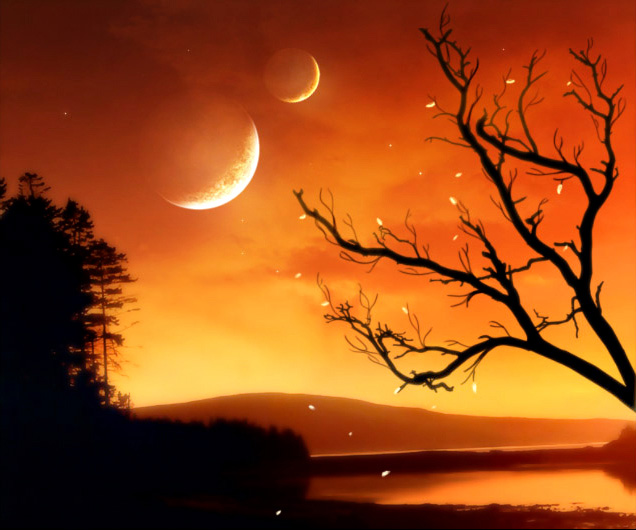
The Orange Sky (tutorial for photoshop editing)
This lesson will explain to you in all details the process of creation of a collage. By means of simple actions we will create a fantastic landscape from several simple pictures.
Let’s find a suitable photo for a background. I used a photo with the pure sky in which the orange shade predominates. Just that is necessary!
Now we make the duplicate of a layer, and we will change Blending Mode on Screen.
Merge Down the layers.
We choose Dodge Tool (Highlights, 50%), and clarify the horizon.
Then we take Burn Tool (Midtones, 50%) and black out the top part of a firmament.
The sky it is too empty. We will insert on the new layer a planet (http://ap123.deviantart.com/). We’ll adjust its size and arrange in the necessary place.
Let’s change the Blending Mode of a layer on Screen to make planet’s background transparent.
One heavenly body, let at be the moon - is too stereotyped. We will make our collage more interesting, and we will add on the sky one more “body”, but smaller.
Let’s change and its Blending Mode on Screen too.
We choose a hard brush with a shade more darkly than background, and we paint over planets inside that planets did not seem like glass.
Then by means of Eraser Tool we will mop up accurate the dark edges of a planet.
To add a tree, I used brushes Tree Silhouette with ready trees (http://xsy.deviantart.com/art/Tree-Silhouette-29527352). You can make it with any other way convenient to you.
Branches must not cover the planet. So we have to change a few arrangement of the last on the canvas. We will displace them a little more to the left.
We enter into Blending Options of the layer and changed them as it is shown on picture.

Let’s make the background softer. We will copy the layer with the background, and we will apply filter Blur – Gaussian Blur to a copy.
We have to reduce Opacity of the layer up to 50 %. Now distant trees do not look more precisely, than near to us.
Let’s add on the sky some shining stars. I used a simple brush of white color, changing the size with 14 pixels. Do not overdo, all should be accurate and with taste.
Now we make the duplicate of a layer with stars, and we will apply to it filter Gaussian Blur.
Let’s find a suitable texture of clouds (http://resurgere.deviantart.com), and we’ll copy it on a new layer. It will add beauty to our sky; will make it more perfect and more interesting. We will put such the size, that the texture would lie down exactly a top of a firmament.
We change Blending Mode of a layer on Soft Light.
By means of Eraser Tool and Smudge Tool we will correct the area at mountains where the texture terminates.
Let’s make little bit more fine boughs on the tree. We draw them by means of an ordinary brush, the size of 2-3 pixels.
We change color on brightly yellow (almost white) and we will draw petals. Some petals in flight to the ground, others are on a tree.
For the further work we have to save the collage in a format jpg, and to open it by Photoshop. In menu Image - Adjustments - Brightness/Contrasts we will put adjustments, as on picture
We put last touches. By Dodge Tool (Midtones, 100 %) we will clarify the area of planets on which rays of light fall.
By means of Burn Tool (Midtones, 50%) we will black out the top part of a firmament.
We choose Dodge tool (the same adjustments), and clarify horizon.
Well, that’s all. The collage is ready. Don’t afraid to experiment. I hope, you have learned something useful to yourselves.
View full size here.
from: http://www.adobetutorialz.com/articles/2985/1/The-Orange-Sky